Custom Style in SwiftUI
Imperative v.s. Declarative
How We Setup Style Normally
In the world of UIKit, it’s natural behavior to setup the style of the view after the creation:
import UIKit

// Create the button
let button = UIButton(type: .system)
// Create and configure the button configuration
var config = UIButton.Configuration.filled()
config.title = "Title"
config.baseBackgroundColor = .systemBlue
config.baseForegroundColor = .white
config.cornerStyle = .medium

// Apply the configuration to the button
button.configuration = config
In SwiftUI, you can also do it with view modifiers:
import SwiftUI

//...
Button(action: {
	// perform action
}, label: {
    Text("Title")
    .foregroundStyle(.white)
    .padding()
    .background(.blue)
    .cornerRadius(8)
})
Update Style Based on States
But, how to update the style with different states of view in both frameworks?
There are some approaches in UIKit, for example, the view like UIButton to update the style:
button.setTitleColor(.label, for: .normal)
button.setTitleColor(.blue, for: .highlighted)
Or we can also subclass it and handle in didSet of the state properties:
class MyButton: UIButton {
    override var isHighlighted: Bool {
        didSet {
            tintColor = isHighlighted ? .blue : .label
        }
    }
}
But, it would be an issue for views in SwiftUI to be configured from outside based on the internal UI states, like the one above, isHighlighted. Using the @Binding for all of them doesn’t seem to be a good idea here.
Style of SwiftUI View
This is where the Style and Configuration comes into play, for example, the style and configuration of the Button:
Let’s start with checking what is the Configuration:
/// The properties of a button.
public struct ButtonStyleConfiguration {

    // ...

    /// A view that describes the effect of pressing the button.
    public let label: ButtonStyleConfiguration.Label

    /// A Boolean that indicates whether the user is currently pressing the button.
    public let isPressed: Bool
}
It’s providing the building blocks and the states of the view. And, in the case of Button, it consists of label and isPressed that I can use to setup the Style, where we setup the views.
Create My Button Style
With the configuration in hand, we can then define our style for the Button like this:
struct RoundedButtonStyle: ButtonStyle {
    var backgroundColor: Color
    var foregroundColor: Color
    var cornerRadius: CGFloat
    func makeBody(configuration: Configuration) -> some View {
        configuration.label
            .foregroundColor(foregroundColor)
            .padding()
            .background(backgroundColor)
            .cornerRadius(cornerRadius)
            .scaleEffect(
                configuration.isPressed
                ? 0.9 : 1.0
            )
    }
}
Which you can see the style can manipulate the configuration.label and update the style based on configuration.isPressed state.
In this way, it’s clean to define the configuration of our view first without thinking too much about the style, that only need to be applied later.
With our custom button style, we can easily setup the Button from the following snippet:
Button(action: {
	// ...
}, label: {
    Text("Title")
}).buttonStyle(
    RoundedButtonStyle(
        backgroundColor: .blue,
        foregroundColor: .white,
        cornerRadius: 8
    )
)
We can use the Button directly with the label and action, which is the essential, and the style of it can be setup separately in the modifier, beautiful!
How to Create Custom Style
This is fantastic!
But the question is, how do you make your SwiftUI View support the custom style?
Well, let me walk you through the process:
Define Configuration
Let’s use a toggle view as an example, which have the properties of:
title: can be a text, but we also making it aViewlike the label of the ButtonisOn: the state of the toggle
struct MyToggleStyleConfiguration {
    let title: Title
    struct Title: View {
        let underlyingView: AnyView
        init(_ title: some View) {
            self.underlyingView = AnyView(title)
        }
        var body: some View {
            underlyingView
        }
    }

    let isOn: Bool

    init(title: Title, isOn: Bool) {
        self.title = title
        self.isOn = isOn
    }
}
Define Style Protocol
We can now define a Style Protocol that has a function for making the body from the configuration:
func makeBody(configuration: Configuration) -> Body
protocol MyToggleStyle {
    associatedtype Body: View
    @ViewBuilder
    func makeBody(configuration: Configuration) -> Body
    typealias Configuration = MyToggleStyleConfiguration
}
Design a Default Style
For the basic form of the view, we need to have a default plain style to start with:
struct DefaultMyToggleStyle: MyToggleStyle {
    func makeBody(configuration: Configuration) -> some View {
        HStack {
            Image(
                systemName: configuration.isOn
                ? "checkmark.square.fill"
                : "square"
            )
            .resizable()
            .frame(width: 24, height: 24)
            configuration.title
                .font(.headline)
        }
        .foregroundColor(.blue)
    }
}
Setup Environment Key
And, in order to add the style as environment value, we need to setup the environment key with default value:
// Create an environment key
private struct MyToggleStyleKey: EnvironmentKey {
    static let defaultValue: any MyToggleStyle = DefaultMyToggleStyle()
}

// ## Introduce new value to EnvironmentValues
extension EnvironmentValues {
    var myToggleStyle: any MyToggleStyle {
        get { self[MyToggleStyleKey.self] }
        set { self[MyToggleStyleKey.self] = newValue }
    }
}
Add View Extension
For making a system-like api, let’s add the extension to the View for modifying the style environment variable.
extension View {
    func myToggleStyle(_ style: any MyToggleStyle) -> some View {
        environment(\.myToggleStyle, style)
    }
}
Create View with Environment Value
It’s time to build the view.
Let’s make your View support the style environment value and making the body from the configuration:
struct MyToggle: View {
    @Environment(\.myToggleStyle) private var style
    var title: String
    @Binding var isOn: Bool
    var body: some View {
        let configuration = MyToggleStyleConfiguration(
            title: .init(Text(title)),
            isOn: isOn)
        AnyView(
            style.makeBody(configuration: configuration)
        )
        .onTapGesture {
            isOn.toggle()
        }
    }
}
Now you have it!
Let’s try it out!
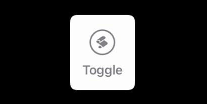
Create a New Style
struct MyFancyToggleStyle: MyToggleStyle {

    var icon: Image

    func makeBody(configuration: Configuration) -> some View {
        VStack {
            icon
            .resizable()
            .frame(width: 16, height: 16)
            .padding(8)
            .foregroundStyle(configuration.isOn ? .white : .gray)
            .background(configuration.isOn ? .blue : .white)
            .clipShape(Circle())
            .overlay {
                Circle()
                    .stroke(
                        lineWidth: configuration.isOn
                        ? 0.0
                        : 2.0
                    )
            }
            .padding(4)
            configuration.title
                .font(.headline)
        }
        .foregroundStyle(configuration.isOn ? .blue : .gray)
        .padding(16)
        .background(.white)
        .cornerRadius(8.0)
        .contentShape(Rectangle())

    }
}
Apply our Fancy Style
Tada 🎉, we can now use our fancy style on our toggle view:
MyToggle(title: "Toggle", isOn: $isOn)
    .myToggleStyle(
        MyFancyToggleStyle(
            icon: Image(systemName: "applescript.fill")
        )
    )